The National Oceanic Atmospheric Administration (NOAA) has created a user-friendly tool to visualize the potential impacts of sea level rise on communities. Called the Sea Level Rise Viewer, the tool allows you to pick an area (in the U.S.) and explore potential inundation through best and worst case scenarios. Additionally, you can use it to explore marsh migration, social vulnerability, and high tide flooding.
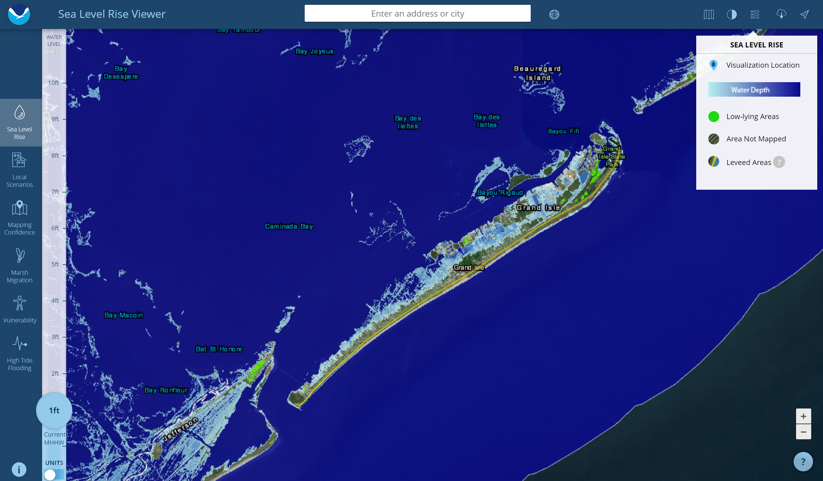
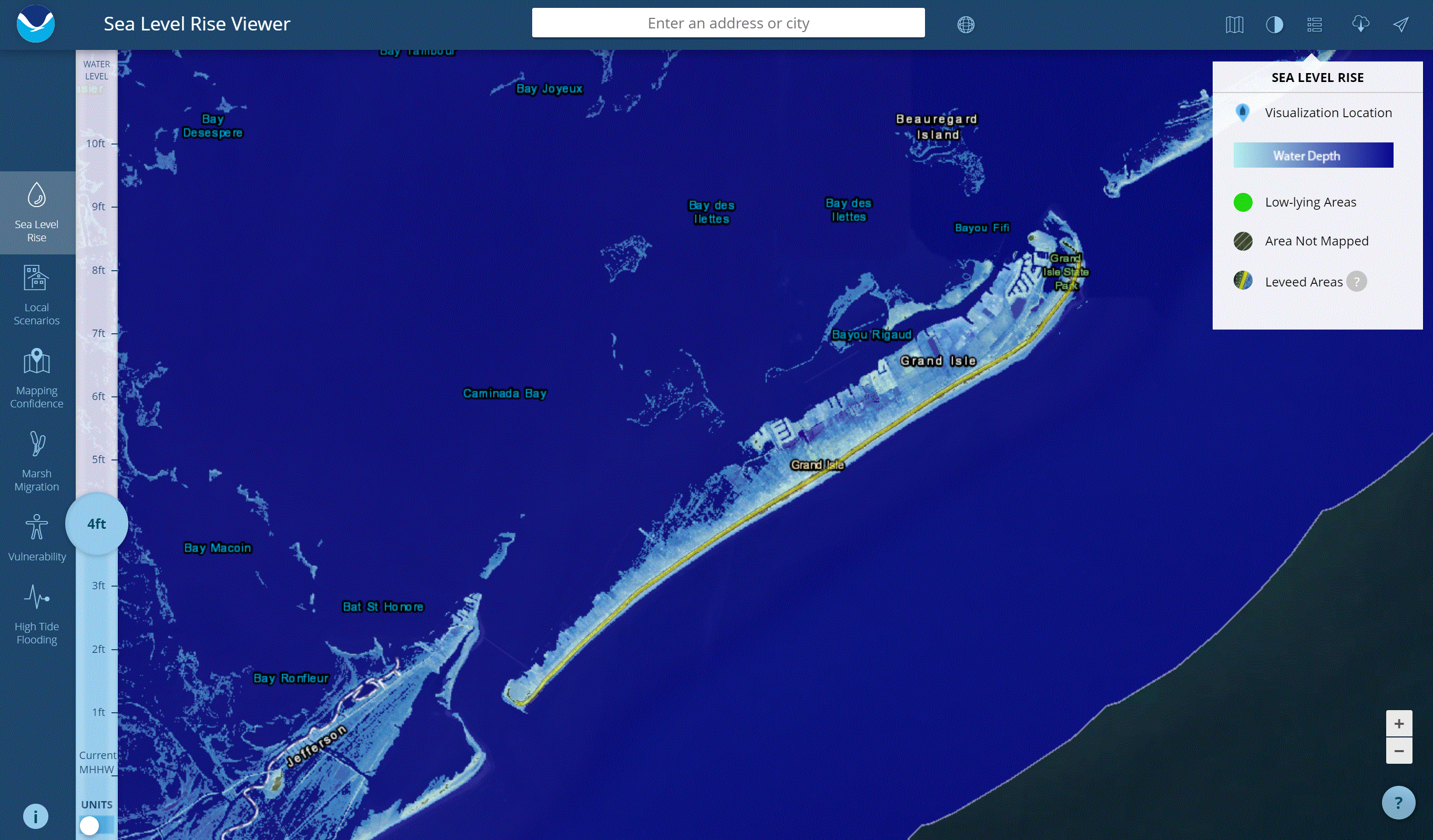
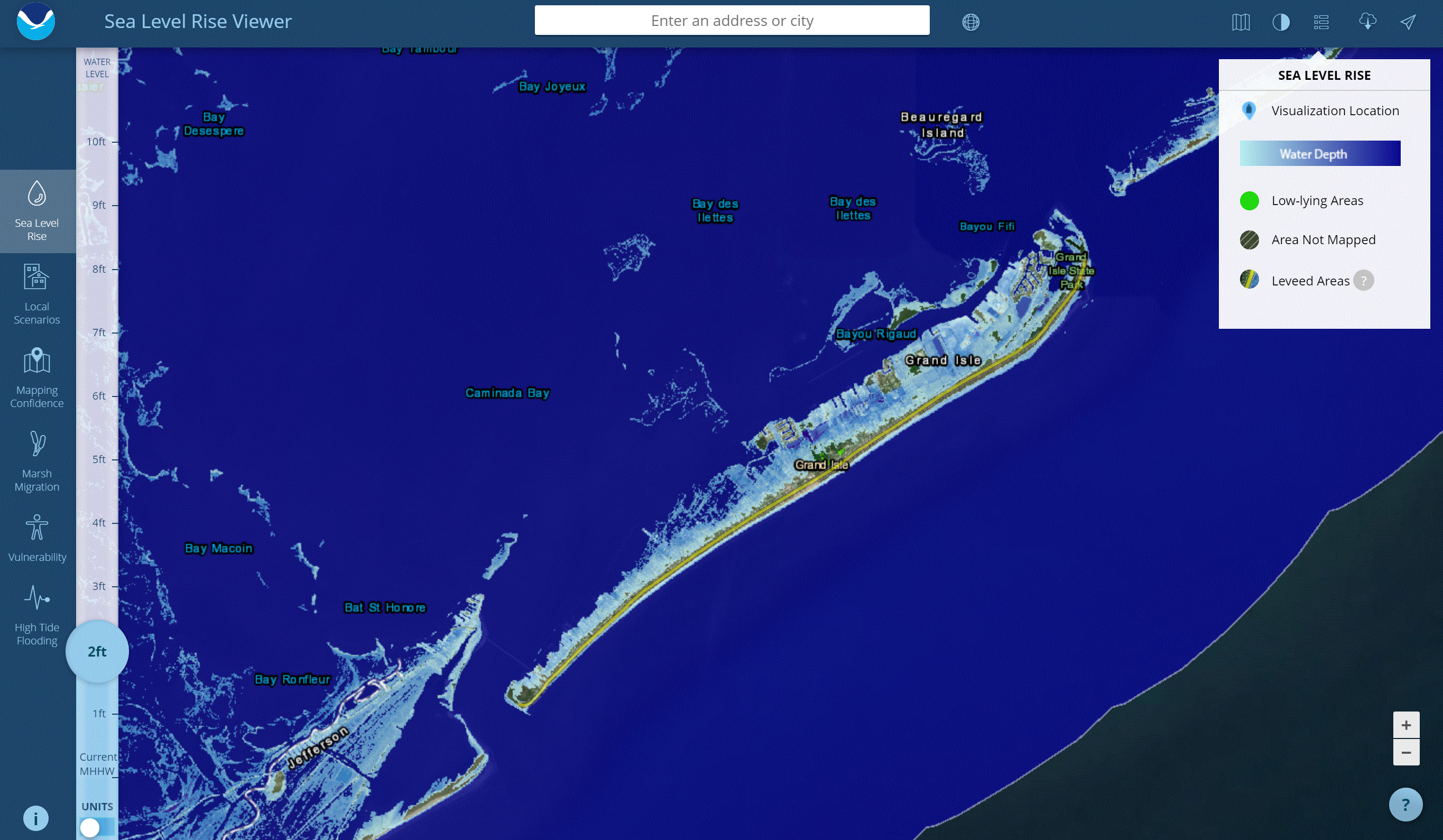
For purposes of this review, we’ll look at Grand Isle, Louisiana, an island that’s been continually battered by flood events.
If you would like to use the tool while you read this, click here. If you would like to see other tools related to Sea Level Rise and Climate Change, click here.

Navigate to the site and you’ll see that the depth is automatically set on MHHW. This stands for “mean higher high water” and it’s essentially the average height of the highest tide recorded at a specific specific tide station each day. If that doesn’t make sense, don’t worry, you can probably find a better description here and here.
Toggle Between Flood Depths To Visualize Sea Level Rise
Before clicking on any of the tabs, take some time to play with the vertical slider on the left hand side of the screen. Pick a particular area you’re interested in (either by zooming in or typing in the address) and toggle between flood depths. As you’ll quickly realize, it doesn’t take a whole lot of sea level rise for an area to be completely inundated.


Use Scenarios To Visualize Sea Level Rise
One of the best parts about this tool is that it let’s you visualize best and worst case scenarios. Using our example (pictured below), we can see that in the year 2060, the most extreme case of sea level rise is 5.25 feet while the least extreme case is 2.33 feet. If you’re interested in how they calculate all of this, click on the “mapping confidence” tab on the left side for more information. You can also use NOAA’s step-by-step tutorial found here.

Visualizing Marsh Migration
As sea levels rise, some marshes are predicted to migrate, disappear, or change type. Click the Marsh Migration tab to visualize migration by year, scenario, and accretion rate and see if your community will be affected.
If you want to learn more about marsh migration before using the tool, go to NOAA’s Tutorial for Sea Level Rise Viewer: Marsh Migration.

Visualize Vulnerability
If you want to see how people and businesses are affected by sea level rise, click the vulnerability tab on the left hand side. Using data from the social vulnerability index, the tool overlays sea level information to see which populations are the most vulnerable to flooding based on age, poverty, etc. In the case of Grand Isle, most of the island falls within the “medium” vulnerability category.

View High Tide Flooding
Use the High Tide Flooding option to see areas affected by “recurrent or nuisance flooding” (shown in red). Click on a tide station icon to see historical flood events per year. As you can with Grand Isle, flooding events have dramatically increased in the past two decades.

