
As of this writing, COVID-19 has killed 296,000 Americans and more than 108,000 are hospitalized. Needless to say, deaths are likely to substantially increase in the coming months. The good news? A vaccine is days away. The bad news? Distribution looks pretty difficult.
In the meantime however, there are several tools you can use to stay informed. And although a simple Google search will probably answer most of your questions, why do that when you can play around with a map (because we all know you have some extra time on your hands anyway… thanks COVID). And, as it so happens, some of these interactives offer more than just basic COVID information!
So, let’s take a closer look at what’s out there… (or see all of the tools here)
#1 CDC COVID Data Tracker
COVID- 19 Tracking from the main source.
Usability: Easy
By: Centers for Disease Control and Prevention
If you really want to visualize what Dr. Fauci’s been saying, then look no further than the CDC COVID Data Tracker. As the main federal organization tasked with combatting the disease, the CDC built this tool to serve as a first and primary resource for anything and everything COVID related.
#2 CNN 411-Coronavirus Resource
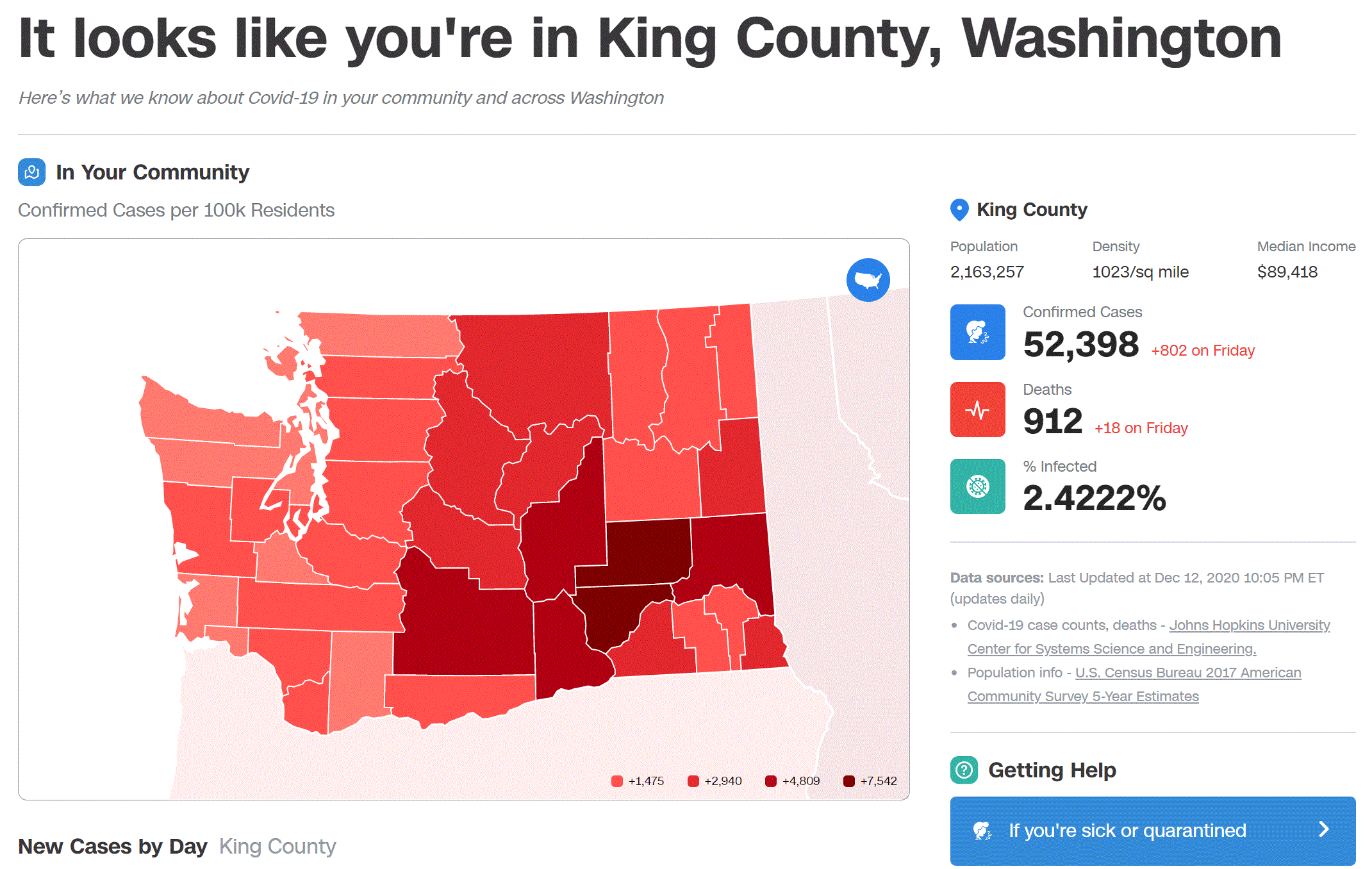
CNN 411 – Coronavirus Resource
Enter your zip code to see COVID information for your area.
Usability: Easy
By: CNN
CNN’s 411 tool is a simple, easy to use resource that’ll give you quick information about your county and state. Simply type in your zip code and it’ll pull up the latest and greatest information (or maybe not so great in this case). It also has some links to some good statewide resources in case you want to do some more research.
#3 COVID-19 Spending Data
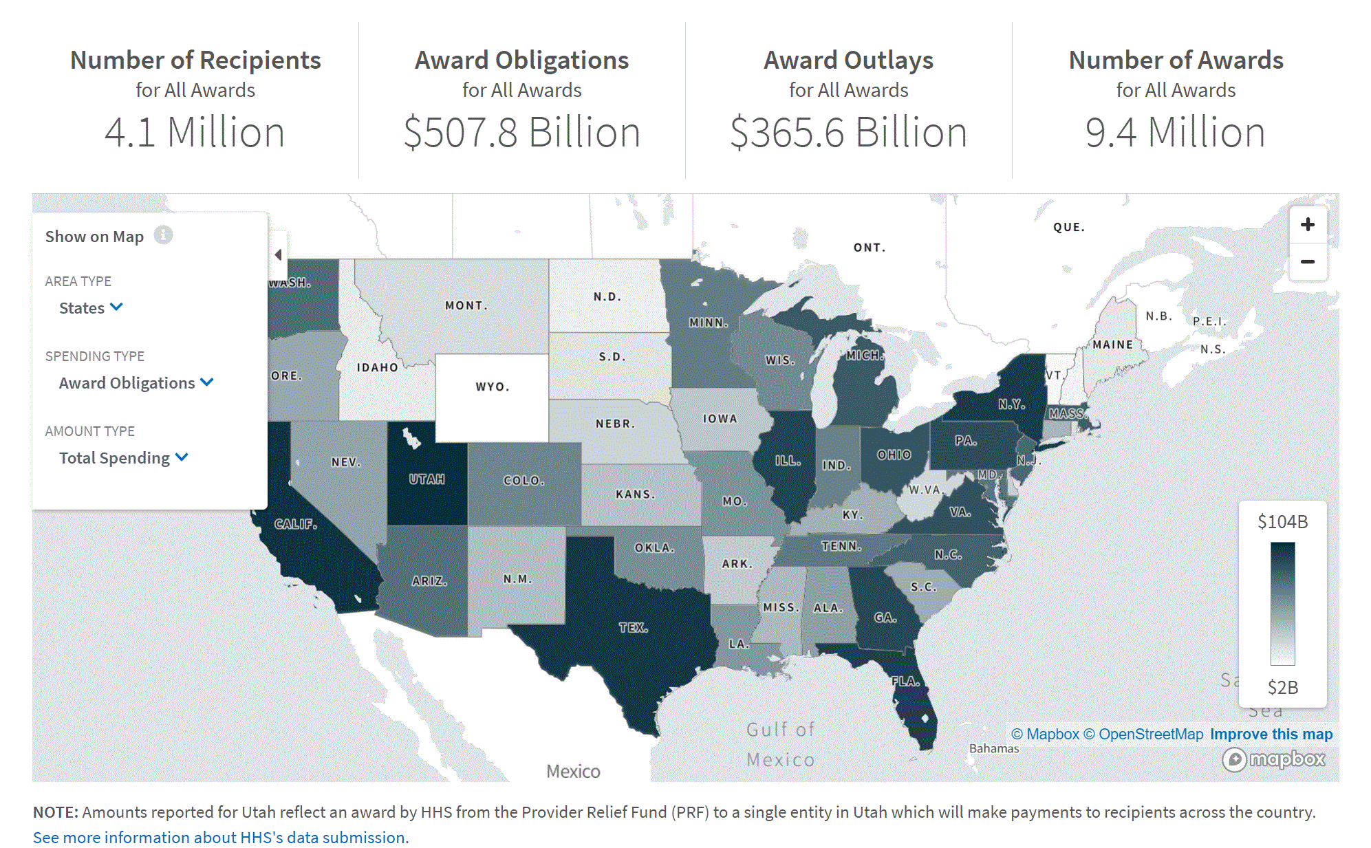
See who received COVID money, who spent COVID money, and what programs were funded through the Coronavirus Aid, Relief, and Economic Security (CARES) Act and other supplemental legislation.
Usability: Easy
By: USAspending.gov
One of the more interesting tools available in the COVID realm is the COVID-19 Spending Data tool which lets you visualize how much federal money has been spent on COVID-19 response. For instance, I know that $2.6 trillion was made available, $1.6 trillion has been paid out, $1.8 trillion has been promised to be spent, and $800.7 billion is remaining. You can also see which federal agencies have received the most. Surprisingly, it’s not the Department of Health and Human Services!
#4 COVID-19 Event Risk Assessment Planning Tool
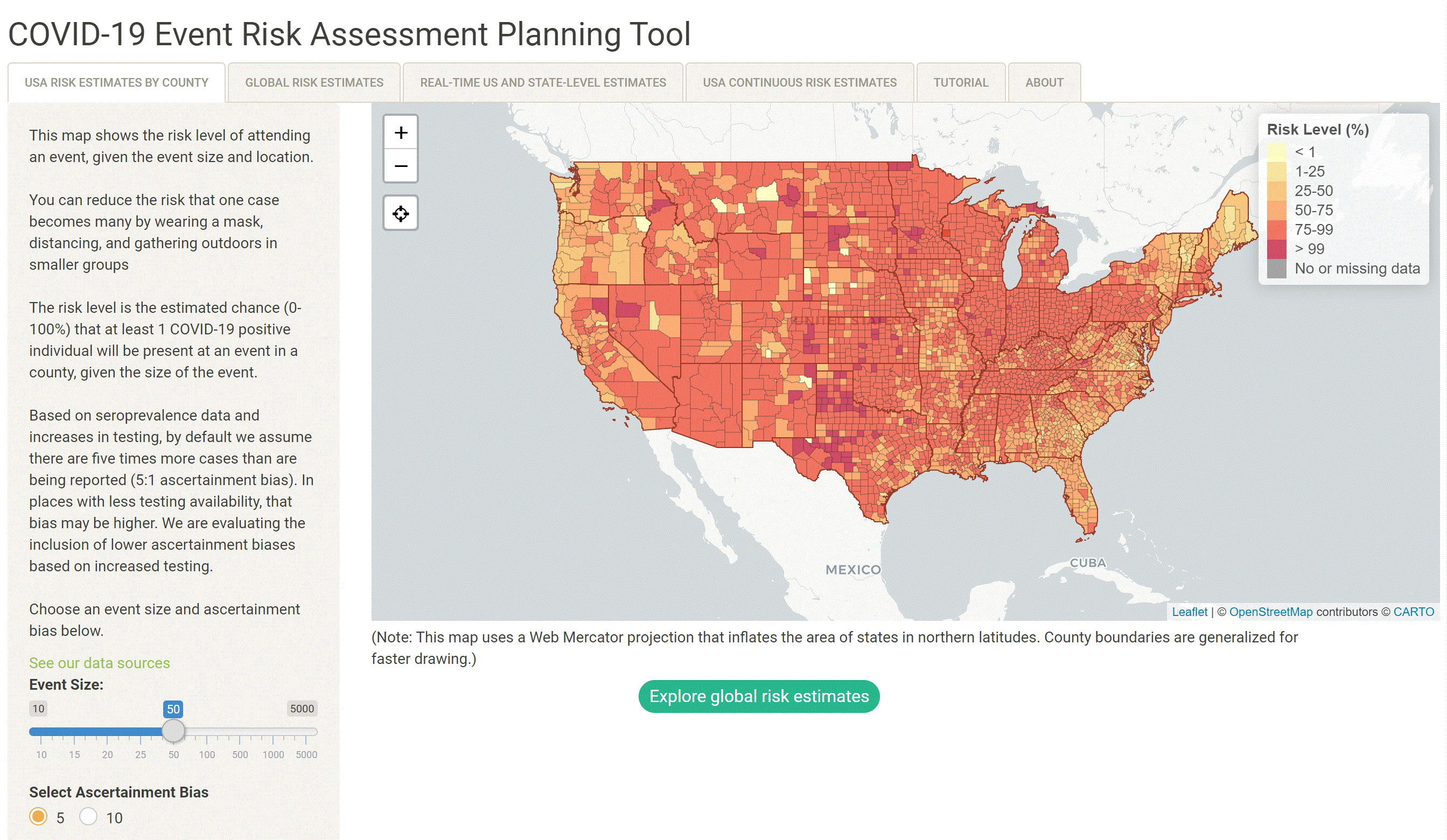
COVID-19 Event Risk Assessment Planning Tool
See the risk of attending an event in your area.
Usability: Easy
By: Georgia Institute of Technology
Ever wondered how likely you are to catch the Coronavirus at a wedding or funeral? Well, there’s a tool for that. See how likely you are to come in contact with the virus by viewing your county and adjusting the amount of people expected to be at the gathering. Currently, in my hometown, there’s a 62% chance of someone having COVID if there are 50 people present at any one event.
#5 COVID Exit Strategy
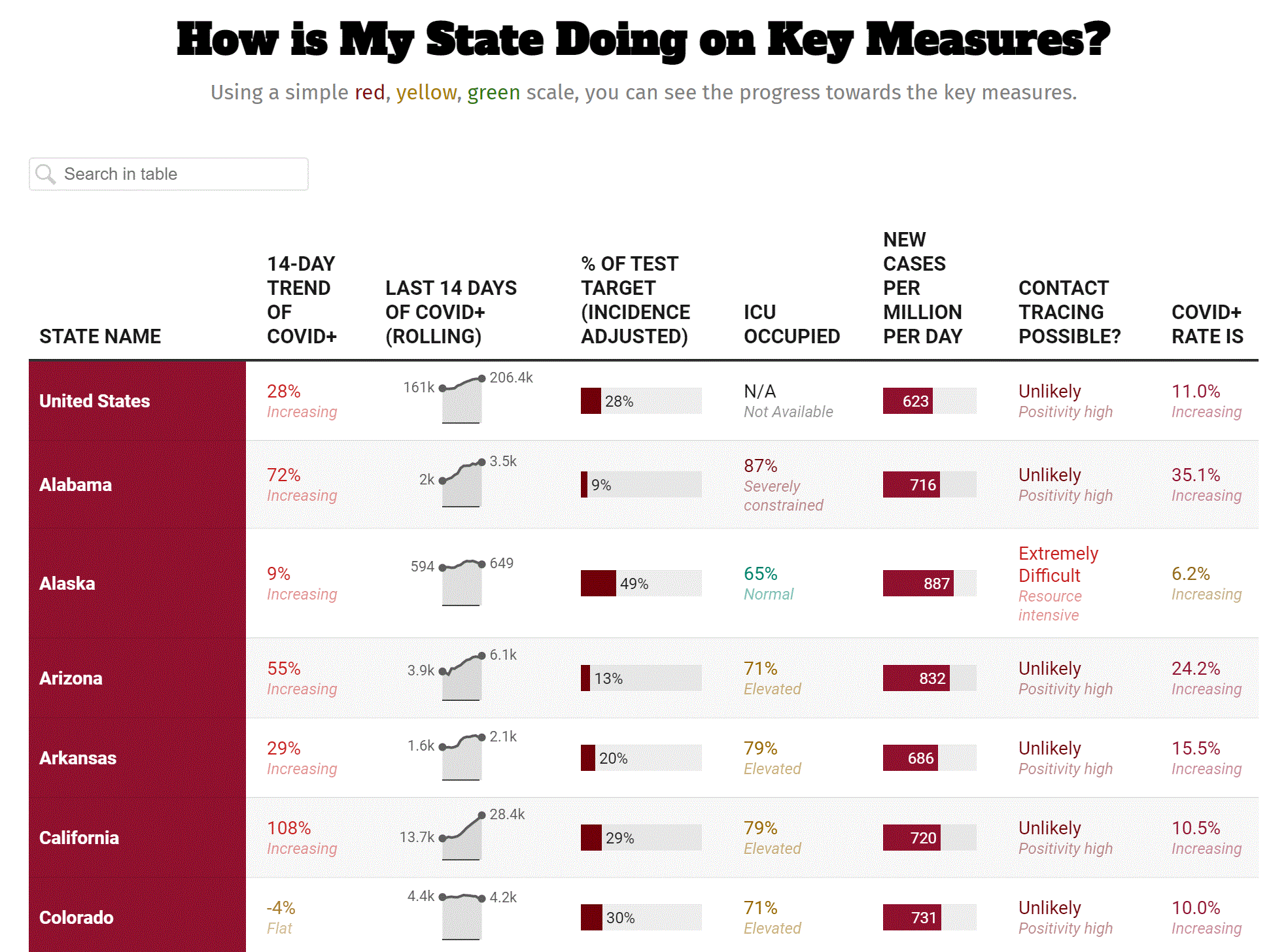
Track our COVID response, how your state is measured, how your state is doing on such measures, how the disease is spreading in your state, if your health system can handle the spread, and how your state is doing on testing.
Usability: Easy
By: Covidexitstrategy.org
See how your state is doing with it’s response to COVID-19. Built by a group of public health and crisis experts, the tool is primarily used to inform local and state leaders.
#6 John Hopkins COVID-19 Tracking
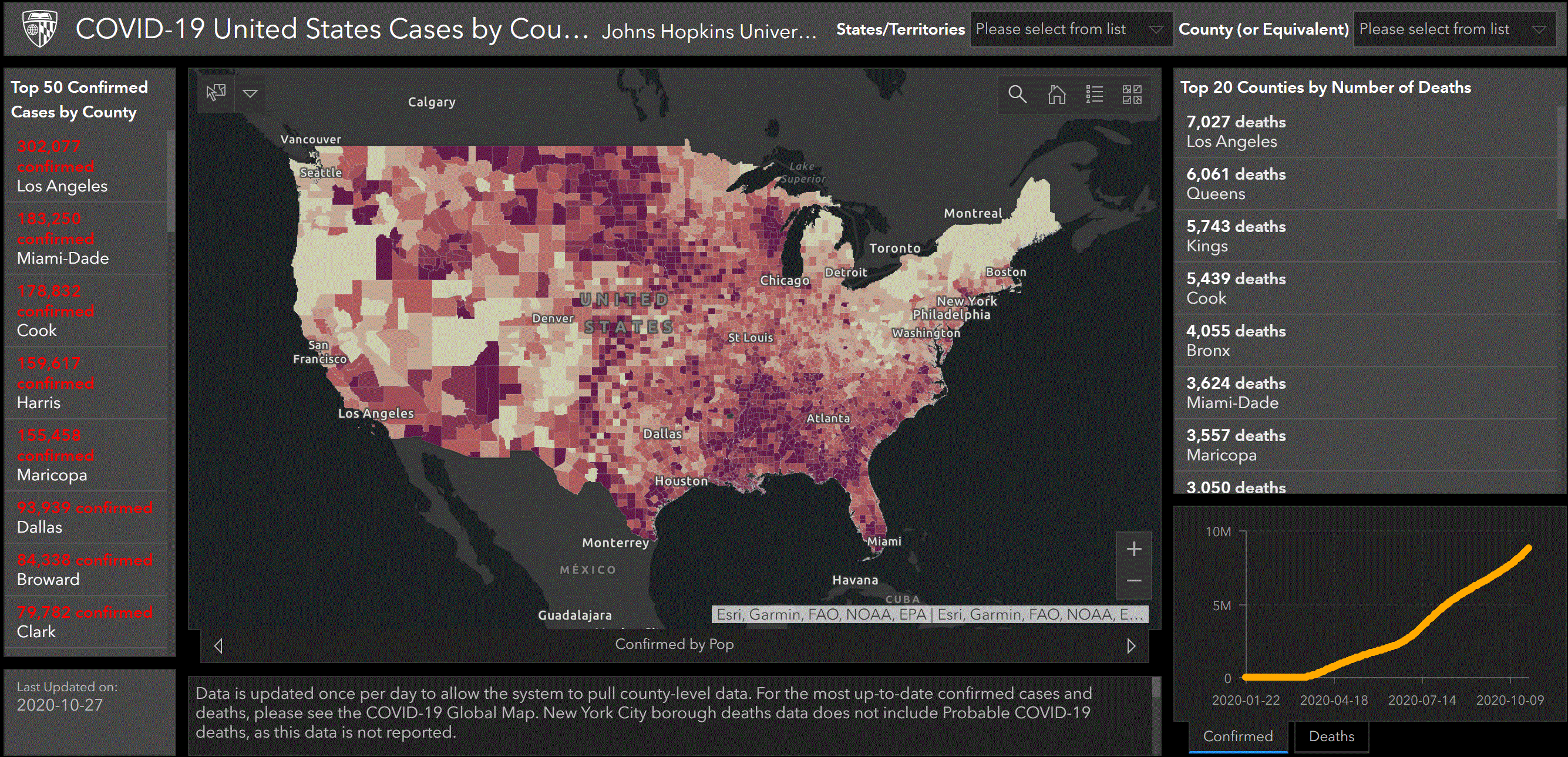
John Hopkins COVID-19 Tracking
Considered the gold standard among COVID-19 case tracking.
Usability: Easy
By: John Hopkins University & Medicine Coronavirus Resource Center
Launched in January 2020, this John Hopkins tracking tool has quickly become one of the most efficient and reliable COVID tools available. As part of the newly formed Coronavirus Resource Center, the tool (and its data) has been viewed almost a billion times and is heavily relied upon by both government entities and the media. It was even named one of the best inventions of 2020 by TIME.
#7 Where Hospitals Are Filling Up
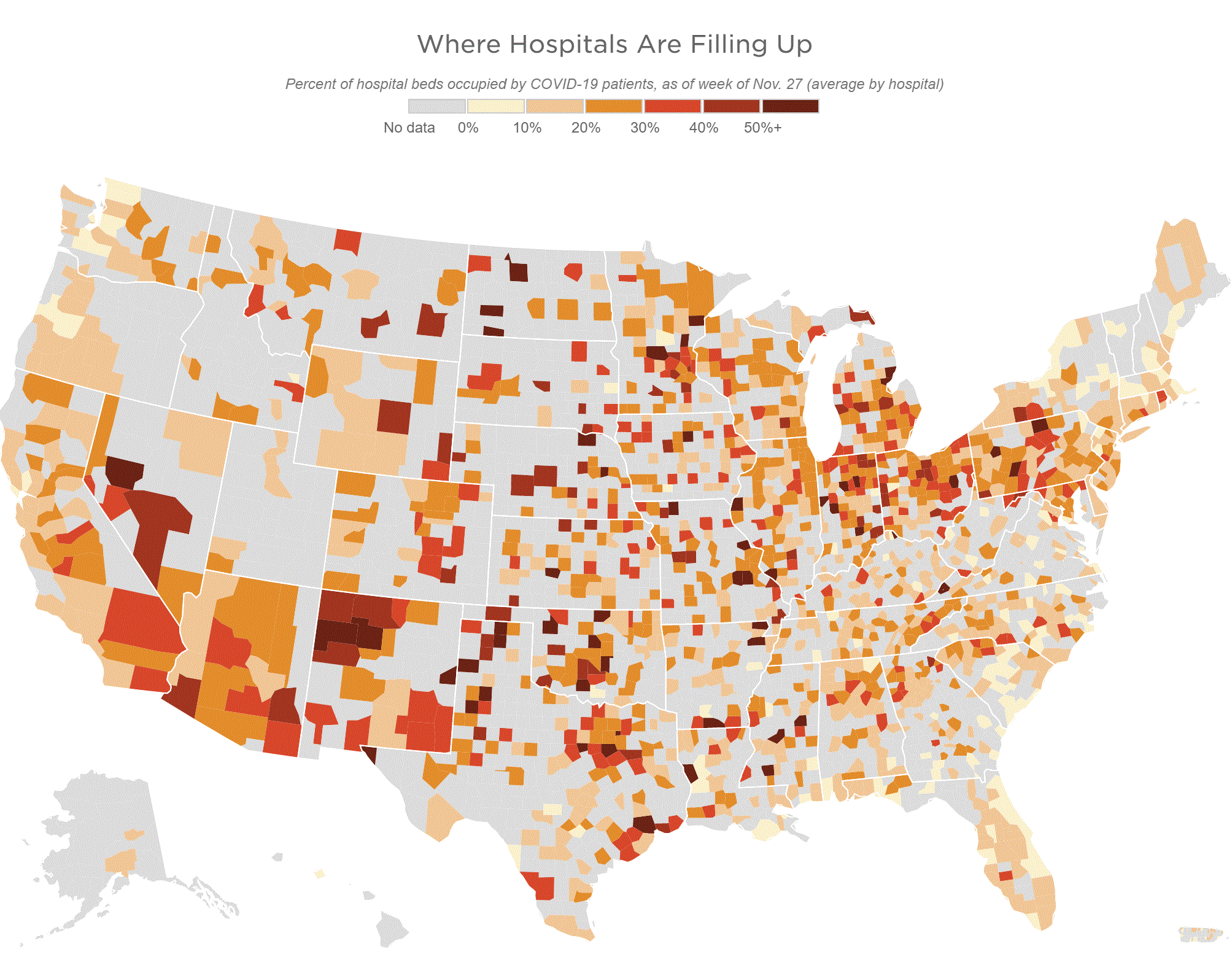
Where Hospitals Are Filling Up
Use this tool to see what percentage of hospitals are occupied by COVID patients.
Usability: Easy
By: NPR
One of the top concerns of the pandemic has been whether or not our hospitals can handle an influx of patients. And with our most recent December surge, this concern is now a reality. Use this tool to see how many hospital beds are filled by COVID-19 patients in your area.
For example, when I click on El Paso County, I know that 52% of hospital beds are filled with COVID-19 patients.