Interactive social justice tools are out there, but they’re pretty hard to find.
Sometimes, they’re a little too teacher-based and reactive in nature, and other times, they’re really good, but completely unknown to the average observer and scattered across the internet.
Lucky for you, however, we’ve compiled a list of the best and most useful interactive social justice tools to help you understand, comprehend, and make sense of social injustice in the United States.
These tools (and other interactive data tools found on Millennial Cities) are not only designed to help you learn, teach, and plan around the concept of social justice, but they’re designed to show you the root-cause of injustice through a birds-eye view.
Each of these tools effectively paints a picture of social injustice and allows users to explore the issue on a free, interactive platform.
Learn from them, use them, and share them with others!
If there’s an interactive tool that’s out there that we have yet to list on our website, please contact us and let us know.
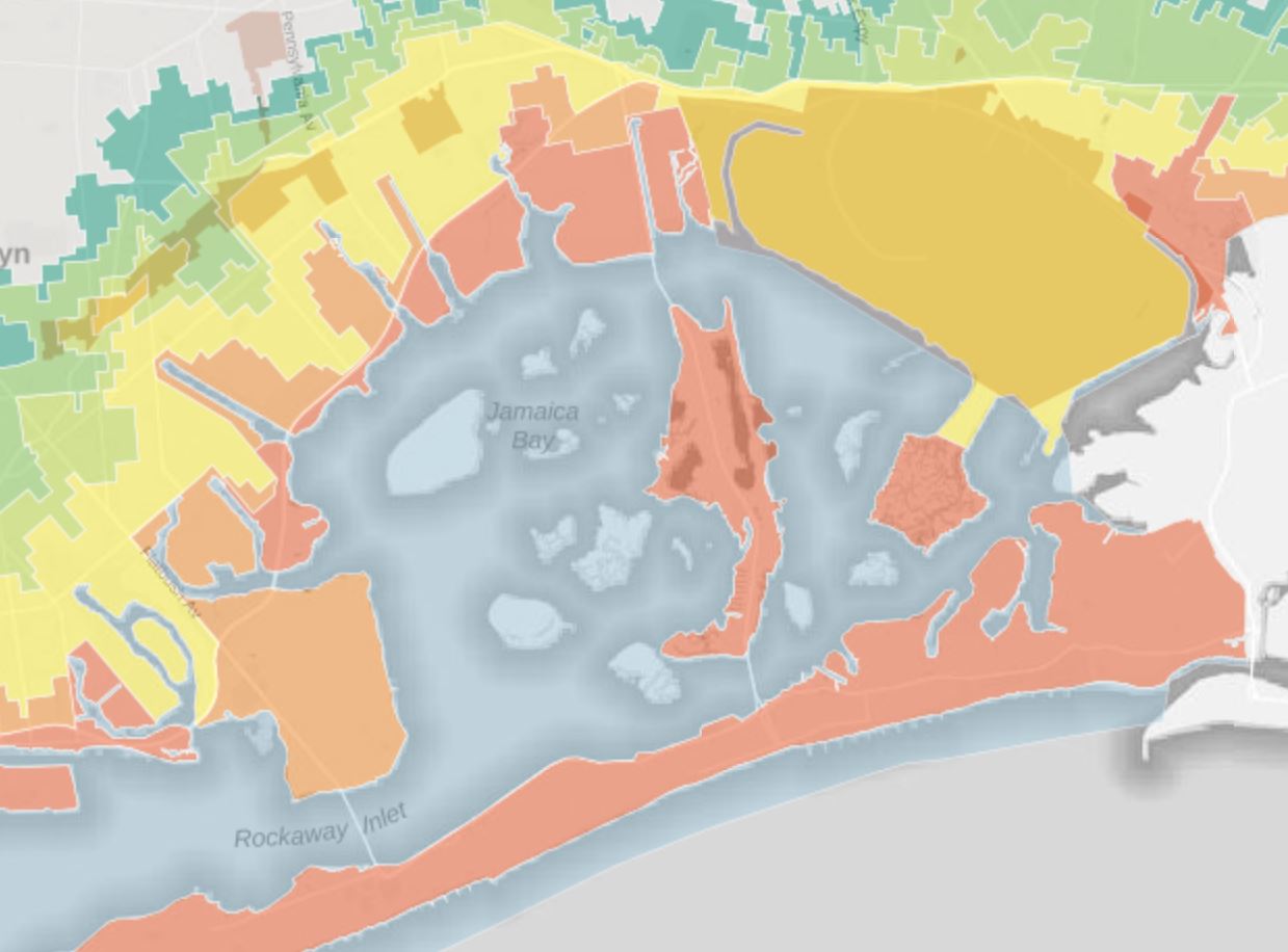
Mapping Inequality: Redlining in New Deal America
Between 1935 and 1940, in the midst of the Great Depression recovery, the Home Owner’s Loan Corporation (HOLC) used data from local real estate appraisers, developers, and lenders to assign housing “grades” to residential neighborhoods across the U.S. in an effort to show a particular neighborhood’s “mortgage security.”
Use this tool to uncover the color-coded maps and see how the HOLC successfully convinced lenders that the presence of African Americans, ethnic groups, and the white working-class “compromised” home value and mortgage security.
Tool created by the University of Richmond with assistance from Virginia Tech, the University of Maryland, John Hopkins University, the Andrew W. Mellon Foundation, and others.
Explore Our Full List of Interactive Data Tools
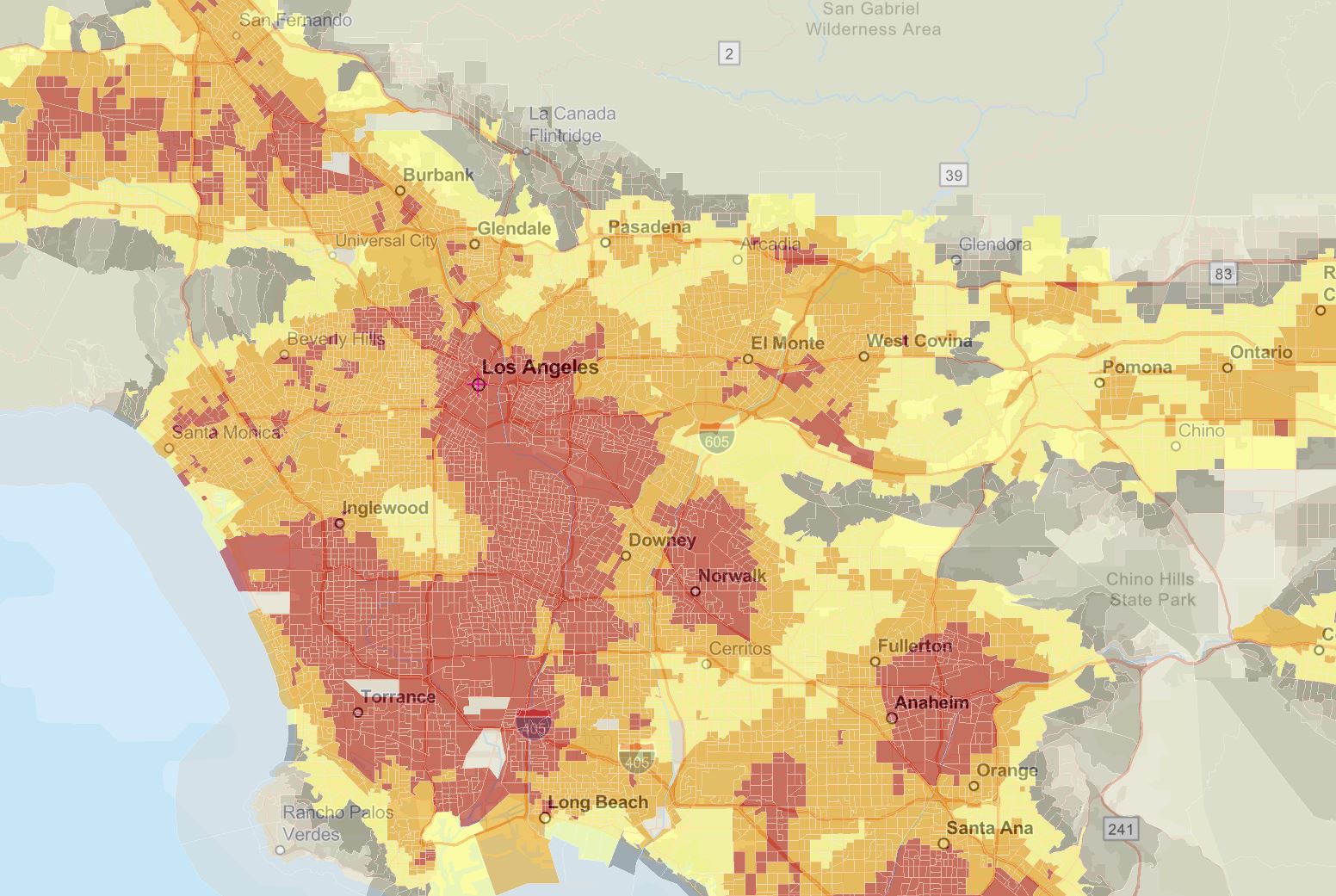
Environmental Justice Screening and Mapping Tool (EJSCREEN)
EJSCREEN or the Environmental Justice Screening and Mapping Tool is a free, interactive tool that was created to provide demographic and environmental information to identify vulnerable communities that are disproportionately impacted by environmental hazards.
Created by the Environmental Protection Agency (EPA), the tool is meant to be a one-stop shop for anything and everything environmental justice and combines EJ indexes, environmental indicators, and demographic indicators to display side-by-side information.
Tool created by the Environmental Protection Agency (EPA)

Explore Our Full List of Interactive Data Tools
60 Years Of Urban Change
The 20th Century had a big impact on American cities — especially during the mid-century urban renewal period which cleared land for highways, parking lots, and public facilities.
Replacing spatially-connected networks of streets and buildings with car-centric infrastructure, these freeways, superblocks, and megastructures forever changed the social framework of American cities.
Specifically impacting low-income and black communities, mid-century planners not only targeted poor and minority neighborhoods, but they used the projects to reinforce segregation. These programs have caused long-lasting economic, social, and physical harm that can still be felt today.
Use this tool to see how American cities have changed over the past 50 years. Once open, click and drag the slider bar as shown in each image to compare cities before and after this period.
Explore Our Full List of Interactive Data Tools
Race and Ethnicity Across the Nation
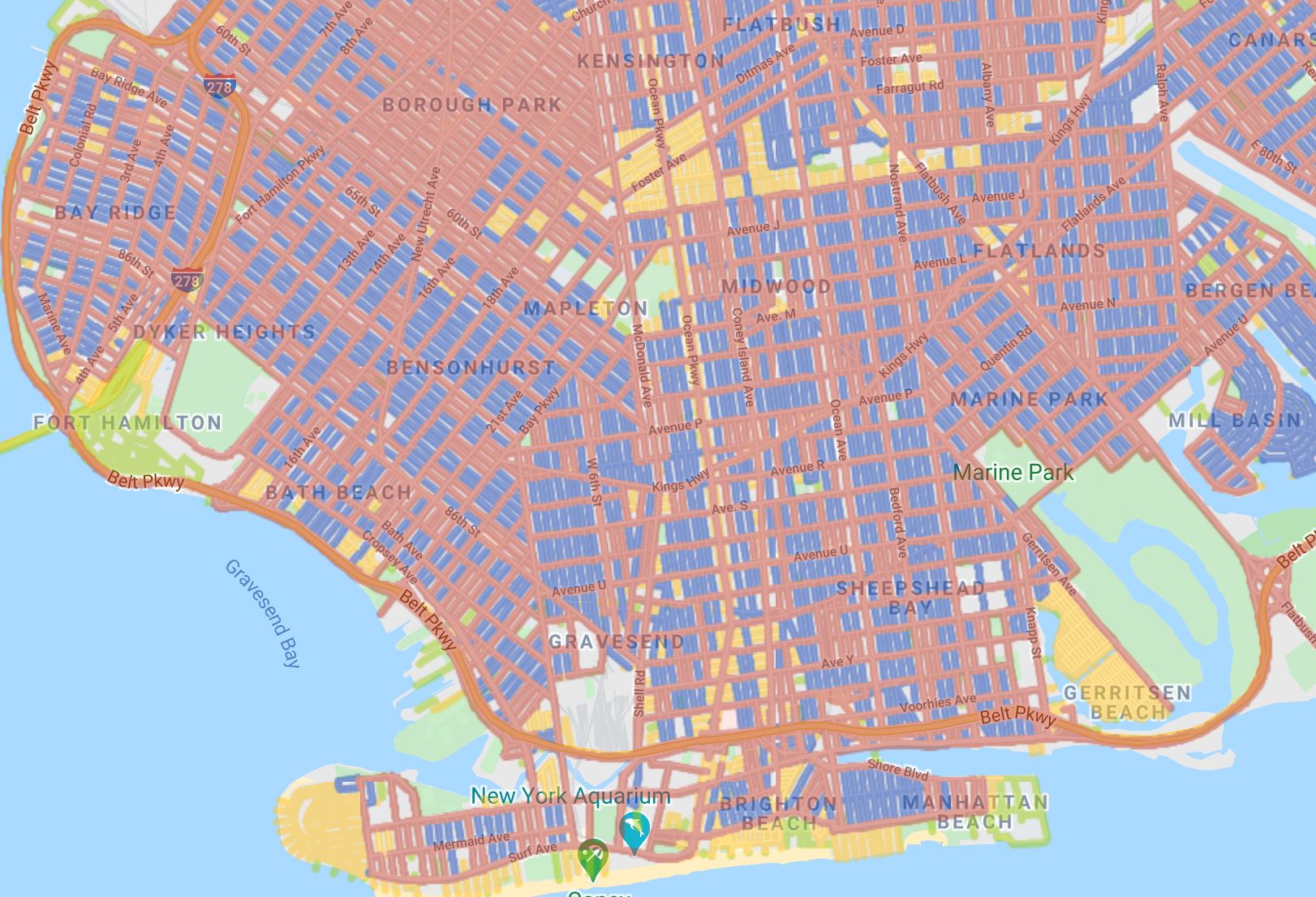
Race And Ethnicity Across The Nation is a free, interactive tool that lets users see a birds eye view of the U.S. population. Type in any address, zip code, city, or state and explore a particular area’s population broken down by race and ethnicity.
Using 2020 U.S. Census data, the tool categorizes racial and ethnic groups as: White, Black, Hispanic, Asian, Native Hawaiian/Pacific Islander, American Indian/Alaskan Native, and Everyone Else — after opening the tool, hover over a group for additional information.
Tool created by CNN
Explore Our Full List of Interactive Data Tools
Renewing Inequality
Between 1950 and 1966, the U.S. federal government set aside funds to remove “slum” and “blighted” neighborhoods.
While the original goal was to improve housing opportunities, most of the funds were used for industrial redevelopment and/or commercial purposes. This resulted in hundreds of thousands of people — primarily minorities — being displaced from their homes and removed from their community.
Use the Renewing Inequality tool to visualize this displacement during the urban renewal period.
Explore Our Full List of Interactive Data Tools
Incorporate These Interactive Social Justice Tools with other Interactive Data Tools
When learning about social justice through the lens of interactive tools, remember to incorporate other subjects into the bigger picture. Ask yourself those tough, outside-the-box questions and think about what other factors are at play.
Are transit-related issues connected to social injustices? Will social justice issues be exacerbated by climate change? What about health issues?
To understand how all of these factors play a part, explore additional web maps and applications on our interactive data tools page. Find out how climate change, transportation, health, crime, and demographics relate to social injustice and explore and interact with the data yourself.
Compare the information you find, put the maps side-by-side, and see where there’s overlap.
Use the tools to further your own interest, share what you’ve found, and make long-lasting change in your community.