Mapping Inequality: Redlining in New Deal America Tool Review
Between 1935 and 1940, in the midst of the Great Depression recovery, the Home Owner’s Loan Corporation (HOLC) used data from local real estate appraisers, developers, and lenders to assign housing “grades” to residential neighborhoods across the U.S. in an effort to show a particular neighborhood’s “mortgage security.”
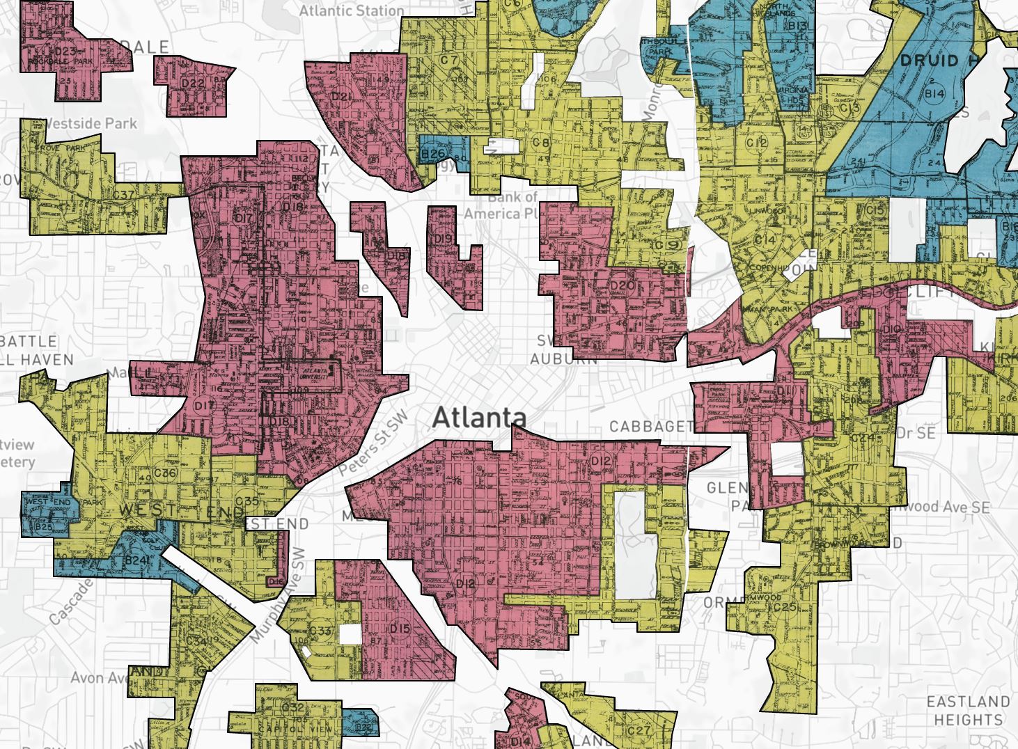
Using color-coded maps to visualize the data, each neighborhood was given an A, B, C, or D rating.
Neighborhoods that were given an “A” rating were colored green and deemed as having minimal risks for investors, banks, and other lenders, neighborhoods that were given a “B” rating were color-coded blue and considered “good for lenders” and “still desirable,” neighborhoods that were given a “C” rating were color-coded yellow and seen as “definitely declining,” and neighborhoods that were given a “D” rating were deemed “hazardous” and color-coded red.
These “grades” are now what we call redlining, a process that put loans and other financial services out of reach for certain locations based off ethnicity or race. In essence, it bucked the idea of offering mortgages, loans, insurance, and other financial services based off qualifications and creditworthiness, instead denying services based on the history and demographic patterns of a particular location.
For immigrants, African Americans, and other ethnic groups, this process was catastrophic. As homeownership is largely seen as one of the most significant means to build intergenerational wealth, redlining redirected public and private capital to white families, leaving black and brown communities with little financial opportunity.
The “Mapping Inequality: Redlining in New Deal America” Tool
While redlining maps have typically been reserved for those actively seeking the information, the University of Richmond and three other universities have digitized the maps, bringing them into the modern era and making them accessible to the masses.
In doing so, they have been able to showcase inequality on an unrivaled scale — finally uncovering a piece of our past that explains so much of the present.
Using the Mapping Inequality: Redlining in New Deal America Tool
To use the tool, open the map (scroll to the bottom if you wish to find the link) and either (1) zoom in to a particular location or (2) type a location in the search bar.
Once you have selected your city, you’ll notice that there are a few options for viewing the HOLC redlining maps. You can view it in its original form, in graded form (which is probably easiest) and also in polygon form. All three options are fairly easy to use.


Once you’ve selected how you want to view the map, click on any one area and it will give you a full breakdown of your selection. That includes information such as area characteristics, inhabitants, what type of buildings exist, and clarifying remarks/descriptions.
The Language Used to Grade Neighborhoods
As you start exploring the tool, you’ll immediately notice that the language used by the HOLC is quite alarming. Words such as “infiltration,” “undesirable,” “detrimental,” and “lower grade” are often coupled with racial descriptions of “Jewish families,” “negroes” and other “foreign” ethnic groups.
For example, in the Gentilly neighborhood of New Orleans, the HOLC described one neighborhood as, “an isolated community of negroes . . . most of the properties are of the shack type and very poorly maintained.”
In a wealthier part of New Orleans, the neighborhood is described as having a “Jewish Children’s Home and . . . a negro school.” But it then justifies these schools, saying, “both of these institutions have been in this location longer than the surrounding homes so apparently they have had no detrimental influence.”
In an even worse instance, one neighborhood description in New Orleans reads: “Negro shacks formerly occupied this block and the purchase by the city has removed this detrimental influence.”
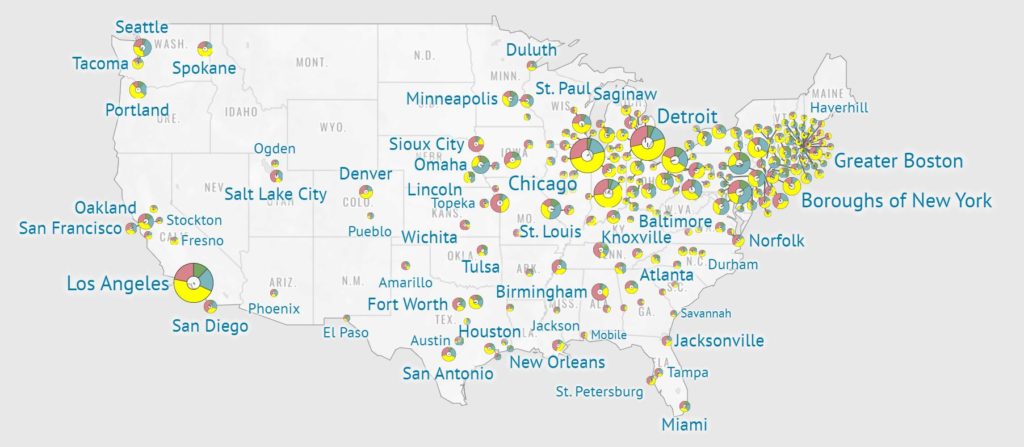
These words weren’t just used in New Orleans — almost every major city in the U.S. was “graded” by the HOLC.
See below to see what they said about Boston, Minneapolis, New York City, and Chicago
Mapping Inequality: Boston Redlining Language
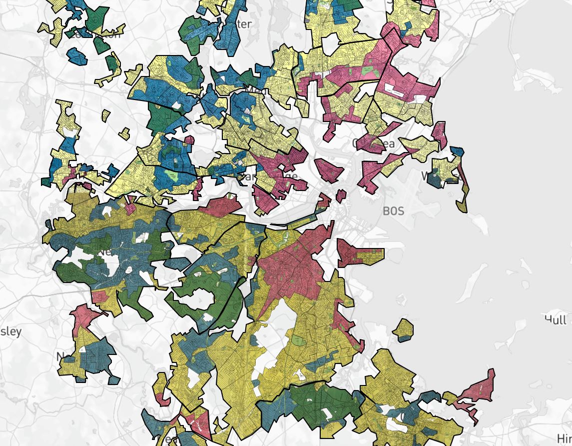
Boston South End (D9) Clarifying Remarks
“Negro heavily concentrated north of Ruggles St. on the west side of Washington. Jewish centered near Columbus Square. A large territory with some streets showing better experiences than the balance of the section.”
Mapping Inequality: Minneapolis Redlining Language
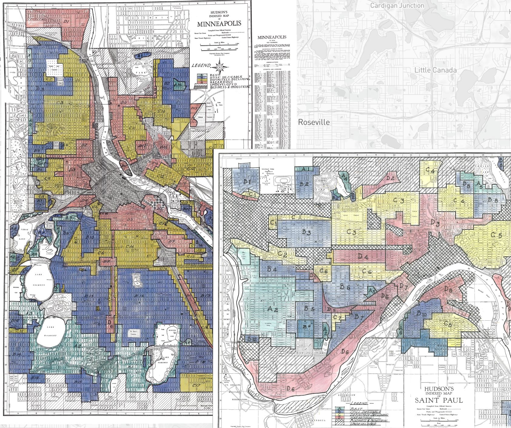
Area (D6) Description
“This area running north and south along 4th Avenue South was once a very substantial and desirable area for homes about 40 years ago. A gradual infiltration of negroes and Asiatics has occurred on 4th Avenue South, beginning at approximately Franklin Avenue moving south to approximately 38th street.”
Language in the Redlining NYC Map
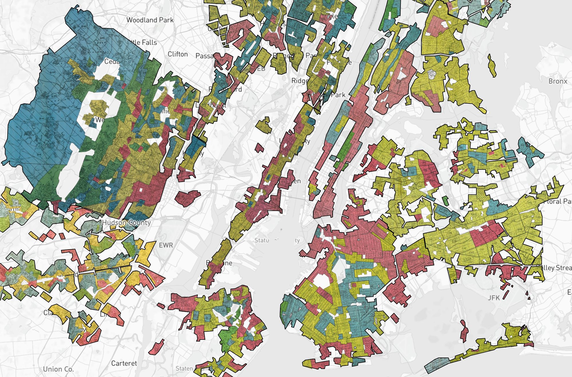
Bedford-Stuyvesant Brooklyn Area (D8) Description
“Colored infiltration a definitely adverse influence on neighborhood desirability although Negroes will buy properties at fair prices and usually rent rooms.“
Language in the Redlining Chicago Map
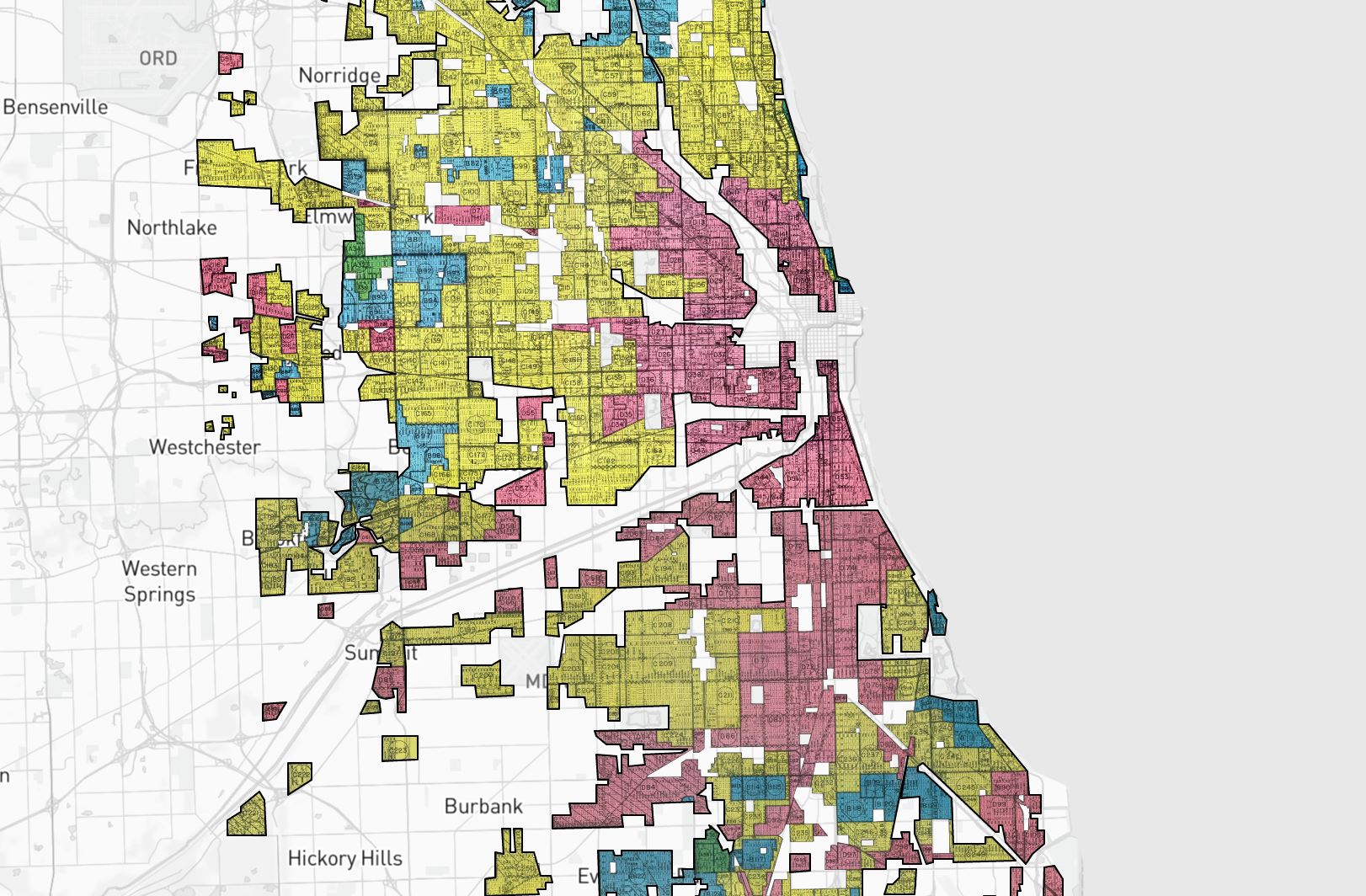
Lake Forest Area (B2) Description
“The area is well laid out and improvements are attractive, but the proximity of negro families on Spruce St. at the southern edge precludes the district from a better rating, and is retarding its development.“
The Effects are Still Being Felt Today
In over 200 cities across the United States, HOLC agents used this grading system to usher in a white, elitist standpoint.
They successfully convinced lenders that the presence of African Americans, ethnic groups, and the white working-class “compromised” home value and mortgage security — a practice that would shape the real estate practice for nearly a century.
Today, it’s easy to see the lingering effects of HOLC’s segregationist tactics.
If you compare the Mapping Inequality: Redlining in New Deal America tool with other social justice and demographics tools, you’ll realize just how much overlap there is between today’s neighborhood poverty and those that were graded “hazardous” all those years ago.
If you want to explore the tool yourself, click this link and explore away: Mapping Inequality: Redlining in New Deal America.
Or click these links If you wish to view other social justice tools and demographic tools.
On the outside, the maps are just maps, full of color and visually satisfying. But what they represent, and the dark history they show, reminds us that structural racism is a product of our own doing. One that must be rectified.