Neighborhood poverty in America may be difficult to pinpoint, but it’s certainly not impossible.
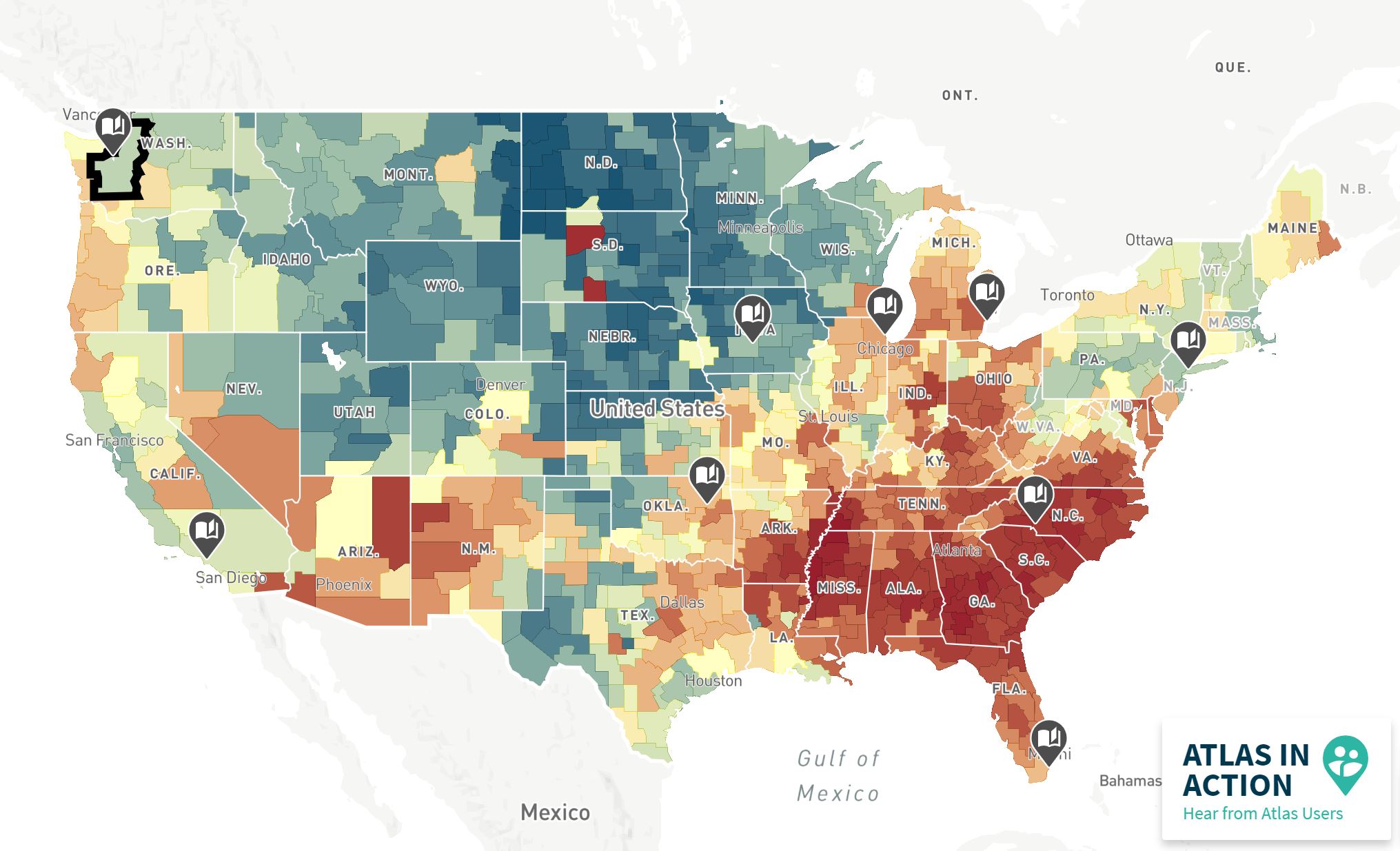
The Opportunity Atlas, created by the U.S. Census Bureau and Opportunity Insights, is an interactive map that successfully identifies which neighborhoods provide children the best chance of rising out of poverty.
Using anonymous data and following 20 million Americans from their early childhood until their mid-30s, the map provides an “atlas” of opportunity neighborhoods across the United States.
Note that when the tool refers to “neighborhoods,” it is typically referring to census tracts, as that’s the smallest observable data available.
Using The Tool To Identify Neighborhood Poverty In America
Here’s How To Use The Opportunity Atlas
- Search For An Area Of Interest
Use the search box or zoom into an area you want to see.

- Select An Outcome That You Would Like To See On The Map.
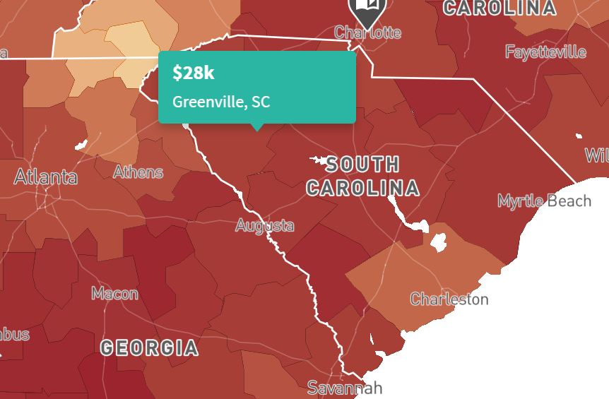
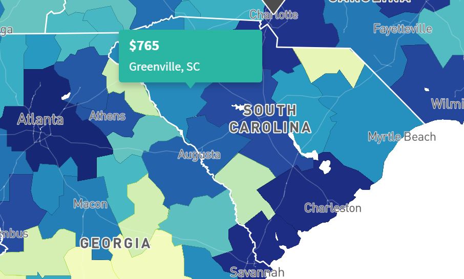
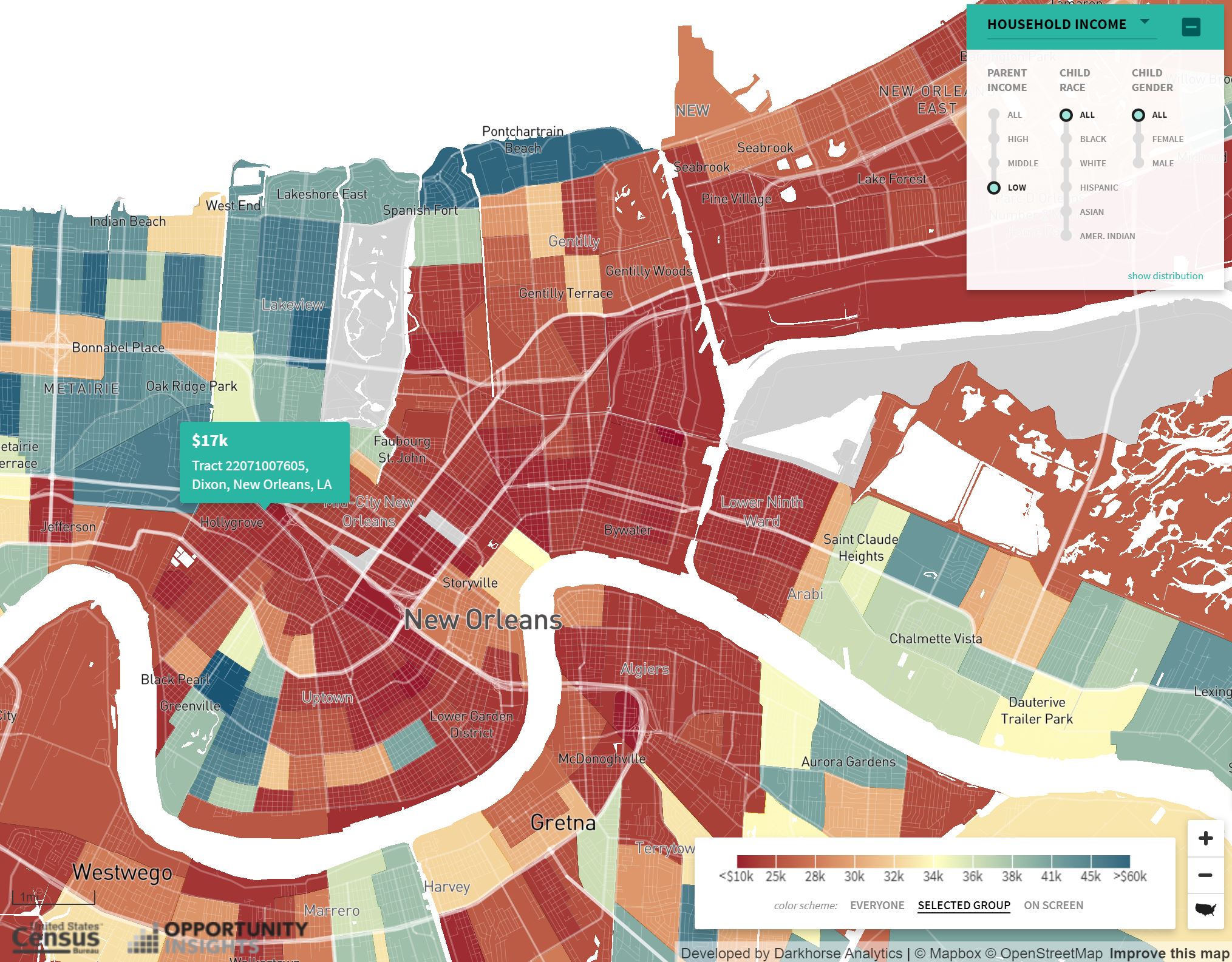
Select from one of several outcomes such as household income, incarceration rate, median rent, high school graduation rate, teenage birth rate, etc. For the image below, we are looking at median rent.

- Choose A Demographic That You Would Like To Explore
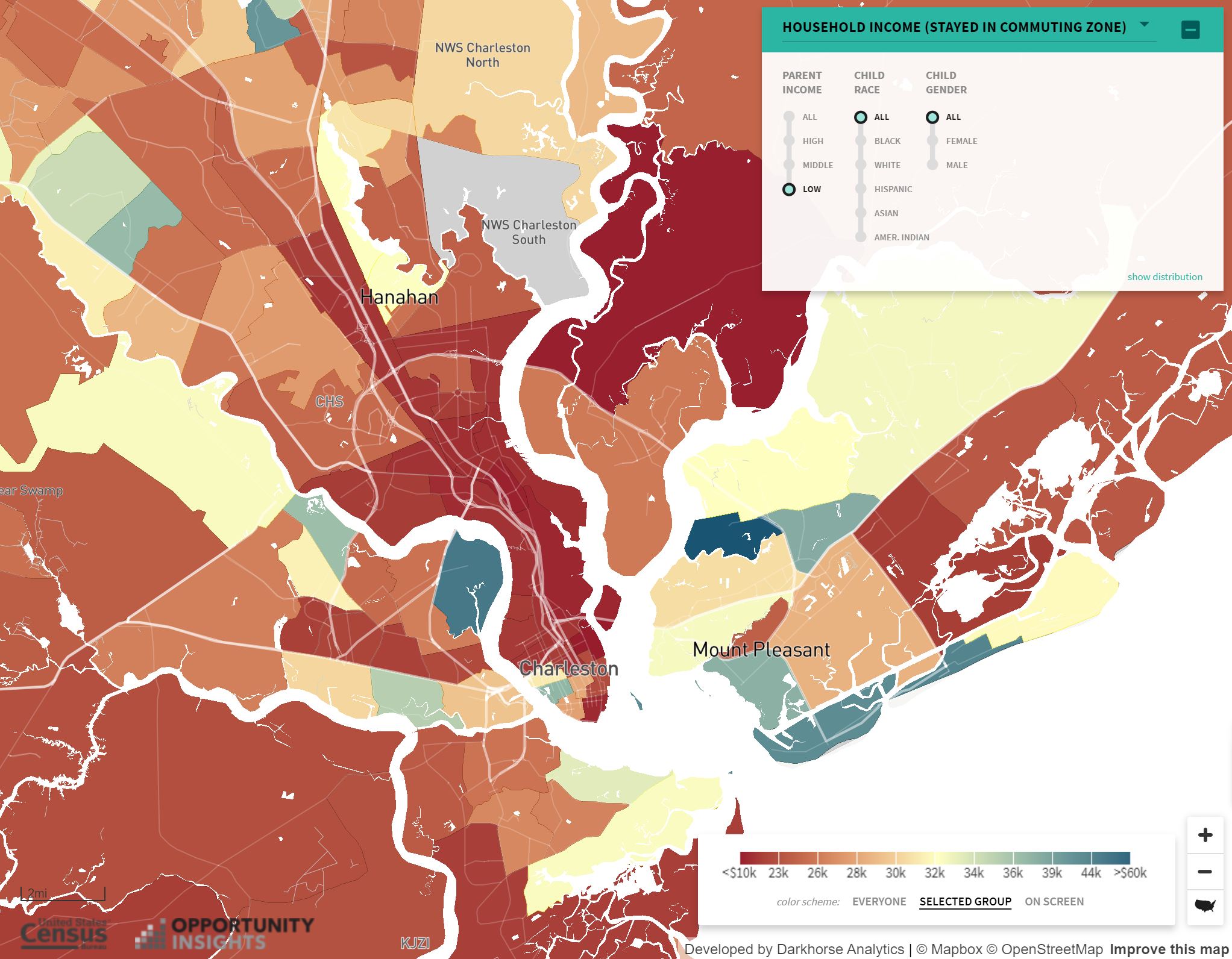
Pick a demographic group that you would like to focus on; toggle between parent income, child race, and child gender. Zoom in to see individual census tracts.

- Analyze The Data
Remember that the data you’re observing is dependent on what you’ve selected. For example, when we’re looking at household income (as pictured above) we are looking at how much people earn in their mid-thirties based on where they grew up. And, as seen in our selection, we are only looking at people raised under low-income families.
Thus, the colors indicate that neighborhoods where kids grew up to earn more income are shown in blue; places where kids went on to earn lower average incomes are shown in red.
Always check to see what the data means!
Why Is the Map Important?
As one of the first maps of its kind, the tool uses both U.S. Census Bureau data and Internal Revenue Service data to highlight and find the correlation between where people grew up and the American dream.
Researchers hope this map will help local citizens, communities, and community leaders better understand and tackle barriers faced by low income Americans so that policymakers can find local solutions.
High Poverty Areas In The United States
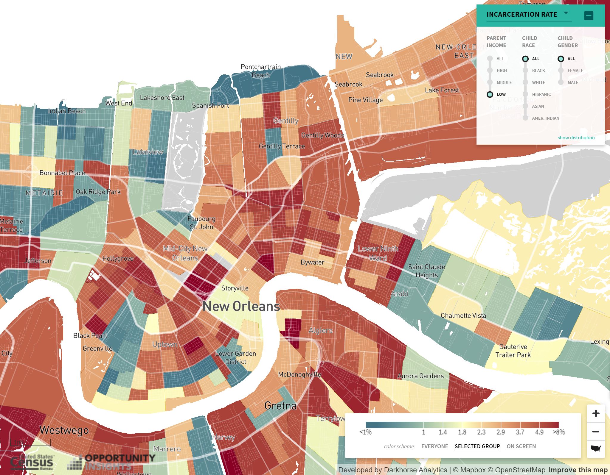
The South seems to have some of the heaviest concentrations of neighborhood poverty. Both rural areas (such as the Mississippi Delta) and urban areas (such as New Orleans) lack the necessary resources to rise out of poverty.
In the image below, toggle the bar from side to side to observe household income and incarceration rates for New Orleans residents who grew up with “low” parent income.
Concentrated Poverty In America
As you’ve probably noticed, there is a lot of variation between neighborhoods.
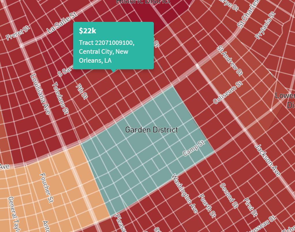
Some red neighborhoods are right next to blue neighborhoods, often within a few miles of each other.
Using New Orleans as an example (see below), we can see that people who grew up below St. Charles Ave in the Garden District went on to earn an average of $40,000 per year as an adult, while those that grew up above St. Charles Ave in the Central City neighborhood went on to earn an average of just $22,000 as an adult.
Use The Tool To Find Solutions
Neighborhoods play an instrumental role in shaping a child’s life.
And while certainly not the only determinant of poverty, they do indicate a relationship between space and a child’s economic outlook.
Thus, it’s important that we highlight barriers that have hindered economic mobility for children. This tool does just that, allowing us to visualize just how drastic these barriers can be.
Find solutions using the Opportunity Atlas here.