SUHII, which stands for “Surface Urban Heat Island Intensity,” has been globally mapped by authors and creators T. Chakraborty and X. Lee with Yale University’s Center for Earth Observation.
As the world is getting hotter, our urban areas are suffering the most, with highly developed neighborhoods sometimes climbing 15°F to 20°F hotter than their neighboring suburbs.
These areas are considered urban heat islands (UHI), which refers to the fact that cities, especially downtown areas, are consistently hotter than their surroundings.
This is mainly caused by pavement and other dark surfaces — such as parking lots, roads, sidewalks, and buildings — where heat is essentially absorbed and then radiated outward.
And while this phenomenon is well known and has been mapped for individual areas or cities, it has never been possible on a global scale.
However, this is no longer the case. As seen in the below information, the Global Surface UHI Explorer has successfully mapped heat islands all over the world, an incredible feat that will potentially change the way we think about development, equity, and planning in an increasingly warming climate.
Using the Global Surface Urban Heat Island (UHI) Explorer
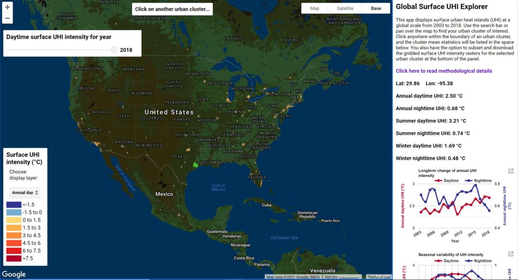
The Global Surface UHI Explorer is an interactive tool that lets you visually monitor “urban heat island” (UHI) intensity across the world. Built on the Google Earth platform, the tool allows users to observe UHI data on a global scale, where cities can be analyzed and compared with one another in an intuitive and user-friendly way.
To see more interactive tools like this one, explore our web mapping applications page where you’ll find hundreds of useful tools related to climate change, social justice, housing, and more.
How to Use the application and visualize SUHII
Open the Global Surface UHI Explorer and you’ll immediately see a map of the United States. Take a second to orient yourself to the map and then look for the legend and layer selection on the left-hand side. Click on it to toggle between display layers and select what you want to see (for example, select “summer day” if you want to visualize urban heat on summer days).
Zoom into an area (it doesn’t have to be the United States) and click on a heat-shaded city (or as the tool calls them, an “urban cluster of interest”). Once clicked, you’ll notice that a table pulls up on the right. Per the Center for Earth Observation, this is your, “mean annual, summertime, and wintertime UHI intensities averaged over the whole cluster for both daytime and nighttime.”
Additionally, you can also look at the two charts underneath the list, which show UHI intensity from 2003 to 2018 and another one showing the variation in monthly UHI intensity. You also have the option to download the charts by clicking on the top right corner of the box.
Comparing SUHII and general UHI from 2003 to 2018
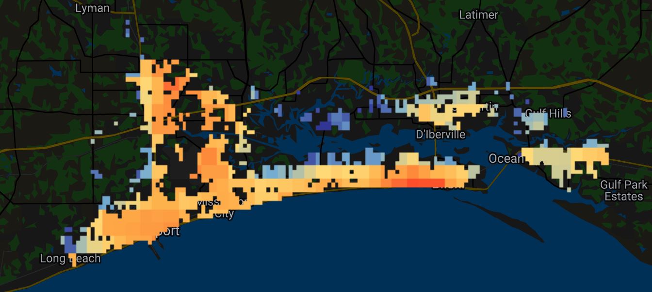
One of the great features of this tool is that you can go as far back as 2003. And although 2021 data isn’t available, it’s still enough to visually see a significant difference in heat intensity.
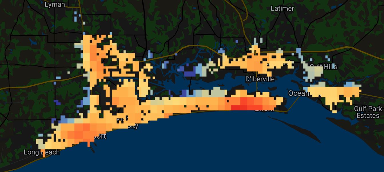
For example, see the below comparison for the Biloxi and Gulfport cluster in Mississippi. After scrolling back and forth a few times, you’ll notice that not only has daytime surface UHI intensity increased, but it’s also expanded into areas it wasn’t before.
Remember that the application is a global UHI tool and can be used all over the world
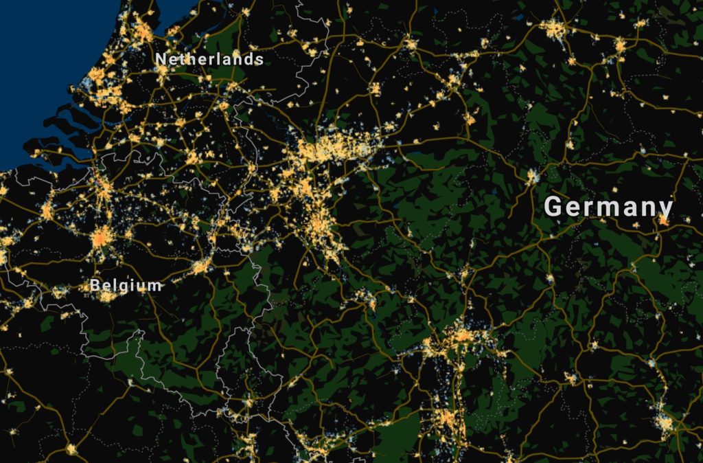
Although the tool pulls up the United States when it is first clicked, remember that the tool can be used anywhere in the world. Feel free to expand the map to view Europe, South America, Asia, Africa, and Australia.
The Uniqueness of the Global Surface UHI Explorer
The uniqueness of the tool is that it isn’t just for one single city or one single area; it can be used anywhere.
And according to tool creator and author TC Chakraborty, this was difficult to do in the past because (1) city SUHII was calculated by the land surface temperature difference using the same buffer width to specify rural reference (if this is confusing, click here), and (2) cities were sometimes defined by their administrative boundaries which made it difficult to compare SUHII areas when there was a mix of urban and non-urban land use.
To fix the issue, the creators developed a new algorithm called the simplified urban-extent (SUE) — which, as explained below, has theoretically fixed both deficiencies.
For the first deficiency, we forgo the use of buffers and calculate the UHI as the LST difference between the urban and rural pixels, as defined by their spectral characteristics, within each urban unit. To address the second issue, we use urban clusters, which may include multiple contiguous cities, as the urban units instead of individual cities. We calculated the SUHI for over 9000 such urban clusters using roughly 17 years of satellite-derived LST data, and 12 years of satellite-derived land use data. Finally, we investigated the influence of vegetation on the seasonal and temporal characteristics of the SUHI intensity at a global scale and for each climate zone. The database created in this study is the most comprehensive characterization of the SUHI to date.”
The Global Surface UHI Explorer: An Interactive Map of Urban Heat by TC Chakraborty
Why do we care and what can we do about SUHII?
There’s a lot of reasons to care about the impacts of urban heat.
- According to the National Weather Service, urban heat accounts for the most deaths during heat waves and is the leading cause of weather-related deaths in the past 30 years. Because city centers already have above-average temperatures, when a heatwave does make its way across one of these areas, the urban heat island worsens the impact — making our most vulnerable populations ill-equipped to counteract the effects (such as the elderly and those with pre-existing health conditions).
- Air pollution is often exacerbated during extreme heat. In a phenomenon called stagnation, pollutants become trapped in the lower atmosphere during hot weather, causing respiratory issues, eye irritation, asthma, and increased allergies.
- Working outside can become extremely dangerous when city temperatures exceed normal levels. Those who work outside during extreme heat are often at risk for heat stress, which can result in medical emergencies such as heart attacks, heat strokes, heat exhaustion, heat cramps, and heat rashes.
- Low-income neighborhoods are disproportionately impacted. People who live below the poverty line often lack the necessary equipment and resources needed to shelter safely. Additionally, as a result of redlining and other race-based discriminatory practices, many of these communities are living in subpar housing, with little access to green space and tree cover.
- Increased energy demand (when using cooling mechanisms such as air conditioners) leads to higher bills, creates unnecessary greenhouse gas emissions, and puts a lot of strain on our power grid.
What can we do about it?
Our solutions are both a city and personal responsibility:
- Planting trees is an obvious and impactful first step, particularly when planted over paved streets. As shaded surface temperatures are anywhere from 20 to 40 degrees (Fahrenheit) cooler than areas with peak temperatures, they are an easy answer that can be implemented almost anywhere. Additionally, urban street trees absorb CO2, improve air quality, and help soak up stormwater.
- Adding vegetation and greenspace is a great pavement alternative that will also soak up stormwater and decrease temperatures. As vegetation and greenspace are natural, they trap and process heat effectively.
- Whitewash areas that have large amounts of dark pavement or concrete. Because black asphalt and dark-colored pavement holds heat and radiates it outward, simply changing the color helps tremendously; however, be mindful that some studies have said otherwise.
- Expand access to public cooling stations and air conditioning. Helping our most vulnerable populations gain access to cooling mechanisms will help reduce heat-related injury and death.
To see more interactive tools like this one, explore our web mapping applications page where you’ll find hundreds of useful tools related to climate change, social justice, housing, and more.
Additional References: Surface urban heat island intensity in five major cities of Bangladesh: patterns, drivers and trends; NOAA, Climate Central